


(QCOSTARICA) You may or may not have noticed by the ‘aguila’, the iconic eagle logo of the Imperial beer brand, has been seen with its head down in the last few days.
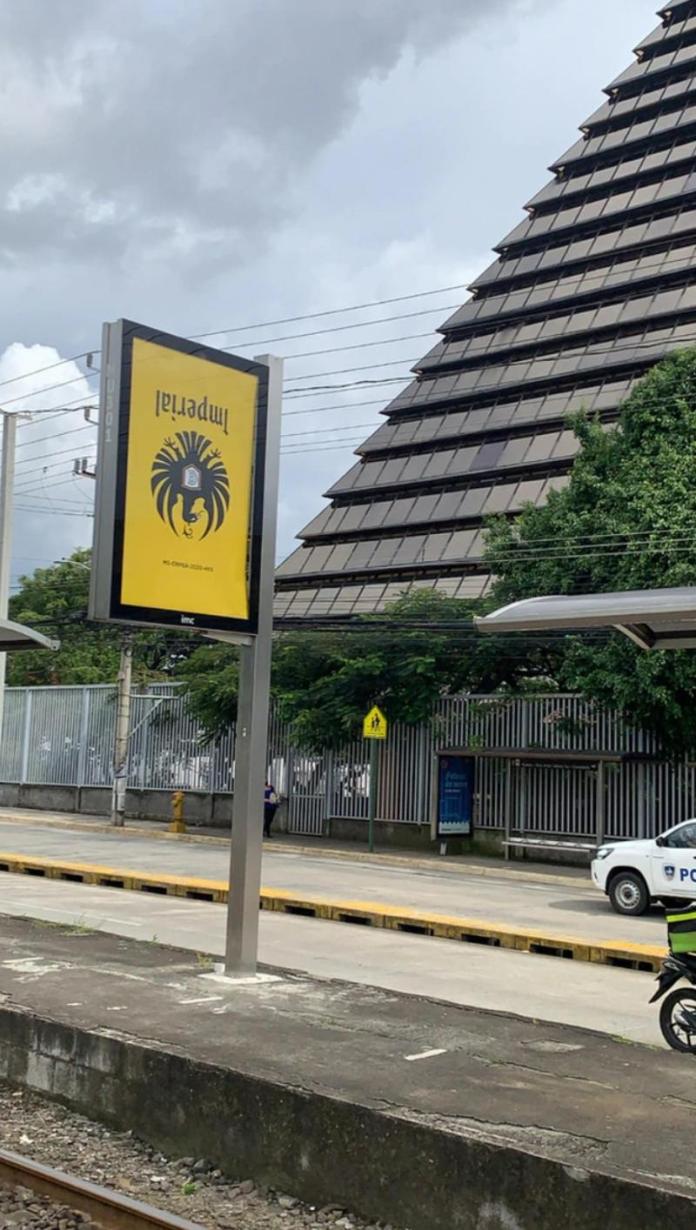
On social networks, people began to talk about the upside down eagle appearing on bottles Imperial beers, on billboards, and on delivery trucks, which many interpreted as a mistake.
 But it was not a printing error.
The thousands of labels and advertisements have a meaning that was later explained by Gisela Sánchez, director of Corporate Relations at Fifco.
It was all done on purpose.
“We want to clarify an issue that has generated a lot of conversation and explain that it is not a mistake. We put the label like this to allude to the fact that for many months we have felt that the world turned upside down and this is our way of sending you the following message: even if the world is upside down, let’s straighten it out together. Just as we are able to turn a bottle of Imperial to see the logo of its label as it should be, we can also turn around what we are experiencing ”, she specified.
The idea
The idea of turning the eagle upside down, after 94 years of being right side up as conceived by the Imperial marketing department, with the ntention of inspiring Costa Ricans to move forward in these troubled times caused by the coronavirus pandemic.
Nicolás Silva, Imperial’s brand manager commented that this initiative, which foresaw a popular and massive impact, had to be “led by a brand proudly Costa Rican, iconic and always on the side of the Tico. That is why Imperial took the lead of carrying the message to its thousands of consumers and inspire them to together move the country forward.
“This is the first construction of an initiative that seeks to inspire, positively penetrate in Ticos, and highlight elements of our essence, which we will comment more fully on in due course.”
Regarding the creative process, Silva preferred not to delve deeper as there are two phases of the campaign that will be revealed later.
Regarding the sacredness of the label, Silva said that the Imperial Eagle “is iconic among Costa Ricans whether they like beer or not, because they know the label as a result of the positioning of more than 90 years.”
Still, making this change for the campaign meant “a decision that required a lot of attention from the team.”
“The need to send a clear, strong and positive message weighed heavily and led us to make a change never seen before,” added Silva.
The brand manager says that the number of bottles with this particularity is limited, so in about two weeks the Imperial Eagle will return to its known position.
Regarding the reaction of Costa Ricans about this change, which was initially perceived as an error, Silva commented that clients wrote to them asking if it was an error”.
This created a very interesting dynamic that greatly added to the message that we were ready to unveil.
“Finally, the upside down label managed to capture attention and represents how the world and Costa Rica is currently due to the pandemic, Imperial is a brand that understands and lives what is happening in the country, as well as its consumers and other people. But it also shows the strength that a country like Costa Rica has to move forward together. It is an idea that comes from the feelings of the people,” he said.